Título da página
JF Seguros
Solutions to keep you ALWAYS safe!
Location
São Paulo
Year
2024
Brazil
An insurance brokerage specialized in insurance, consortiums, and retirement plans, aiming to stand out from a monotonous and repetitive market through modern, creative, and accessible attributes, all while preserving the brand’s trustworthiness and professionalism.
The brokerage’s identity was built upon three pillars:
Creativity, Accessibility, and Trust.


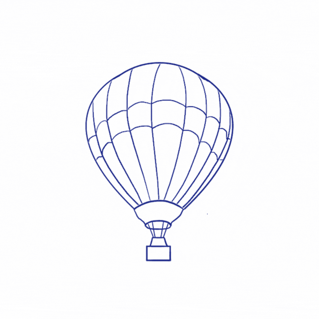
For the creation of the logo symbol, our main inspiration was the Hot Air Balloon: bringing creativity and lightness to the brand, the balloon conveys the idea of something grand yet gentle, floating yet secure, always steady and silent, flying above any earthly concern or problem.
Within the symbol, the silhouettes of the letters J and F are carved out as a reminder that, when choosing JF’s services, the client can feel safe and supported, seeing the JF brokerage as a problem-solver: constant, unshakable, always floating above.
.png)
.png)
.png)
For the brand’s color palette, we selected shades of blue, from the coolest to the most vibrant, to evoke a sense of seriousness and professionalism, while also communicating calm and safety.
Yellow and white serve as supporting colors, bringing visual contrast rarely found in competitors, along with a touch of creativity and lightness.

.png)